HTML Pages Pics


Click to visit our brand new site!

Friday, June 28, 2013

One Room Three Ways - Recap and Link Party

I hope you all have enjoyed our One Room, Three Ways Series! You can find my first version of our living room here:

My second version here:

And finally my third version:

And now it's your turn to link up what you've done! Please make sure to link back and link with your exact blog post.


I hope you all have a fabulous weekend! I can't wait to see what you all link up!


P.S. - If you have sent an e-mail or left a comment and are waiting for a response I promise I will get to you soon. Due to our move I was without internet for several days and just finally sat down to my computer last night for just a a few minutes to get this post written and then am headed out of town today for the weekend for a wedding. As soon as I get back though I will get to work on my inbox! 


Thursday, June 27, 2013

Day 3 - One Room, Three Ways


Well, today is Day Three, of the One Room, Three Ways Challenge. You can check out Tuesday's post to see Day One and catch up on what this challenge was and the requirements.


Here is what the room looked like when I started:


And here is Day One:


And Day Two:


And here is Day Three:

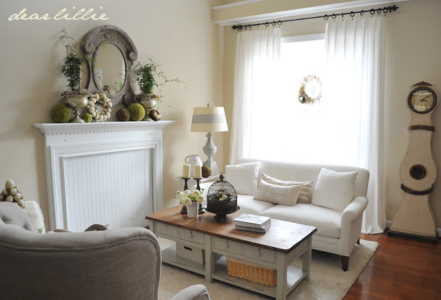
After I photographed this option, I ended up keeping the room this way so you if you have been on our site in the last month or two you have probably seen a few glimpses of this overall look. Originally I had planned on doing a pink themed room for my final option based on Lillie and Lola's usual color suggestions =), and I even found a few things that I thought would help me do it in a grown up way. However, I used most of my budget on the second option and didn't want to break the rules so ended up just using many of the same items I have had in here over the years but just rearranging them a bit. First, I switched the sofa back to help separate the living room from the dining room and then put the mirrored chest back in front of the window and then I used the two tufted chairs on either side of it. I put the mirror that we always have above the mantel back in it's usual spot and then moved the ottoman back in here that had been in the family room for a couple of months.


Because the living room didn't change all that drastically I thought it would be fun to add these wingback chairs to the dining room table to help change that room up a bit too. I LOVE having wingback chairs used at the end of the table and even though day to day it would not have been practical in this space I am hoping I will be able to do something like this in our new home where we will have a formal dining room. (There are a few more photos of the dining room at the end of this post).


Now head on over and check out all of these other rooms for day three. I have LOVED getting to see everyone's first two looks so I cannot wait to see what they all have done now for day three!


I hope you all have a fabulous Thursday! I'll be back tomorrow morning with a recap and the link party!

Wednesday, June 26, 2013

Day 2 - One Room, Three Ways


Hello Everyone! Today is Day TWO, of the One Room, Three Ways Challenge. You can check out yesterday's post to see Day One and catch up on what this challenge was.


Here is what the room looked like when I started this challenge:

And here it was for Day One:

For Day One (and Day three which I will show you tomorrow) I was able to use pretty much all things I already had. For this setup though I used most of the budget we were allowed to purchase a few accessories. For this room I purchased the lamp shades, pillows, throw and lantern from Target all in their clearance section.


The mirror came from Lillie's room, one of the lamp bases came from our family room and one from Lola's room, and I moved this ottoman back in here (I had tried it out on the family room for a few weeks prior to this challenge but ended up moving it back in here where it stayed after this challenge.)


Oh how I wish these lampshades came in a different color! I LOVE them but this color really doesn't work with the rest of our home. =(


I have to say of the three looks I did this was my least favorite although it was really a ton of fun to do and I really liked having something that looked different than what I normally would do. 

Now head on over and check out all of these other rooms for day two. It was so much fun seeing all of their amazing spaces for day one so now I cannot wait to see what they all have done for day two!


I hope you all have a fabulous Wednesday! I'll be back tomorrow morning with look three!

Tuesday, June 25, 2013

Day 1 - One Room, Three Ways


I am so excited today to be joining several other bloggers for a One Room, Three Ways series hosted by Jennifer Rizzo. I have to say this has been by far one of those most fun blogging things I have done. I have always enjoyed switching things up a bit but always stick with my same general theme so it was fun to mix up my colors a bit more for this! The guidelines for the challenge were to basically take a room and "shop" our home and show it styled three different ways. We were allowed a $100 budget if need to spruce up with fresh flowers  or  a few pillows or something, but we didn't need to spend anything. We were supposed to rely of furniture placement and using what we already had. Today, tomorrow and the next day we would be showing a different version each day and then Friday will be a recap and link party for anyone that wants to show their restyled spaces. 

 (If you are new here: we just moved into a new home yesterday. I did this challenge before we packed up our old home. Also, our internet isn't up and running yet at our new home so it may take me a while to respond to any questions or comments but as soon as I have a chance I will get to them!)


I chose to change up our living room. Here is what it looked like the day that I started playing around with things for this challenge:

And here is my first new look:

For this look I went a little more modern. I have to admit this was my favorite one but I didn't keep it this way because it didn't flow with the dining room space that's connected.  I took the chairs from the living room and flanked the mirrored chest with them. (The mirrored chest used to be in that spot but had been in the dining room since last fall so I moved it back in here). The trunk I bought at an antique mall right after I graduated from college. Eventually I passed it down to Dana, and then Jason and then it came back to us and it was fun to use it again. I think I have a spot for it in our new house. The black and white pillows are from Target and I bought them for something else but was able to use them for this project. I had planned on swapping out the draperies for the striped gray and white ones in our master bedroom but ran out of time that day (I did all of this right around the time we put our house on the market so I had to work quickly to get everything back in it's place!)


This large picture over the mantel came from our bedroom. I bought it from Pottery Barn back when I was in college with my "birthday money" one year.


I moved the large chalkboard in from the dining room.


The black lampshade and the clock were in our bedroom too so I brought those in to add some black to the mirrored piece.

I love this little spool and scissors from Savvy!


The above images are what I decided upon for option one, but here are a few other things I tried for this black and white look. I added a more graphic pillow and put the chalkboard up on the mantel.


And I also tried switching out the chairs.


Now head on over and check out all of these other rooms for day one. I know I cannot wait to see them all!


I hope you all have a fabulous Tuesday! I'll be back tomorrow morning with Look #2!


Related Posts Plugin for WordPress, Blogger...